Before
After
Packaging / Brand Identity
Tropics brings authentic filipino flavors to the millions of kababayans* who settled so far from home
*fellow fillipinos
Before
After
This packaging redesign was inspired by Louise Fili’s prompt, “Good design makes a product taste better.”
My team immediately gravitated towards the idea of redesigning ube jam packaging, a popular Filipino dessert. Because of my Filipino heritage, I knew just how delicious but under appreciated these foods are in the U.S.
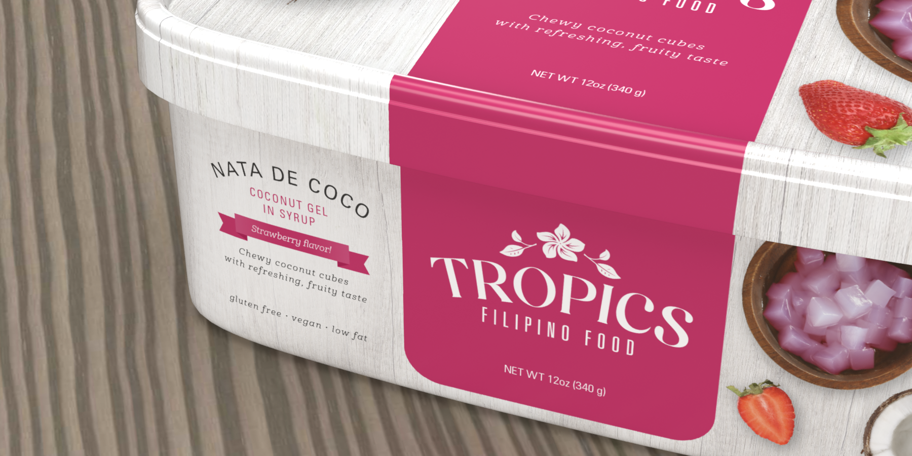
Detail shot
We chose to redesign Tropics, an established Filipino food brand that originated in 1971. Their mission is to bring authentic filipino flavors to the millions of fellow filipinos who settled so far from home.
Tropics has a wide variety of filipino foods. However, we decided to focus on their sweet preserve offerings which includes ube jam and coconut gel.
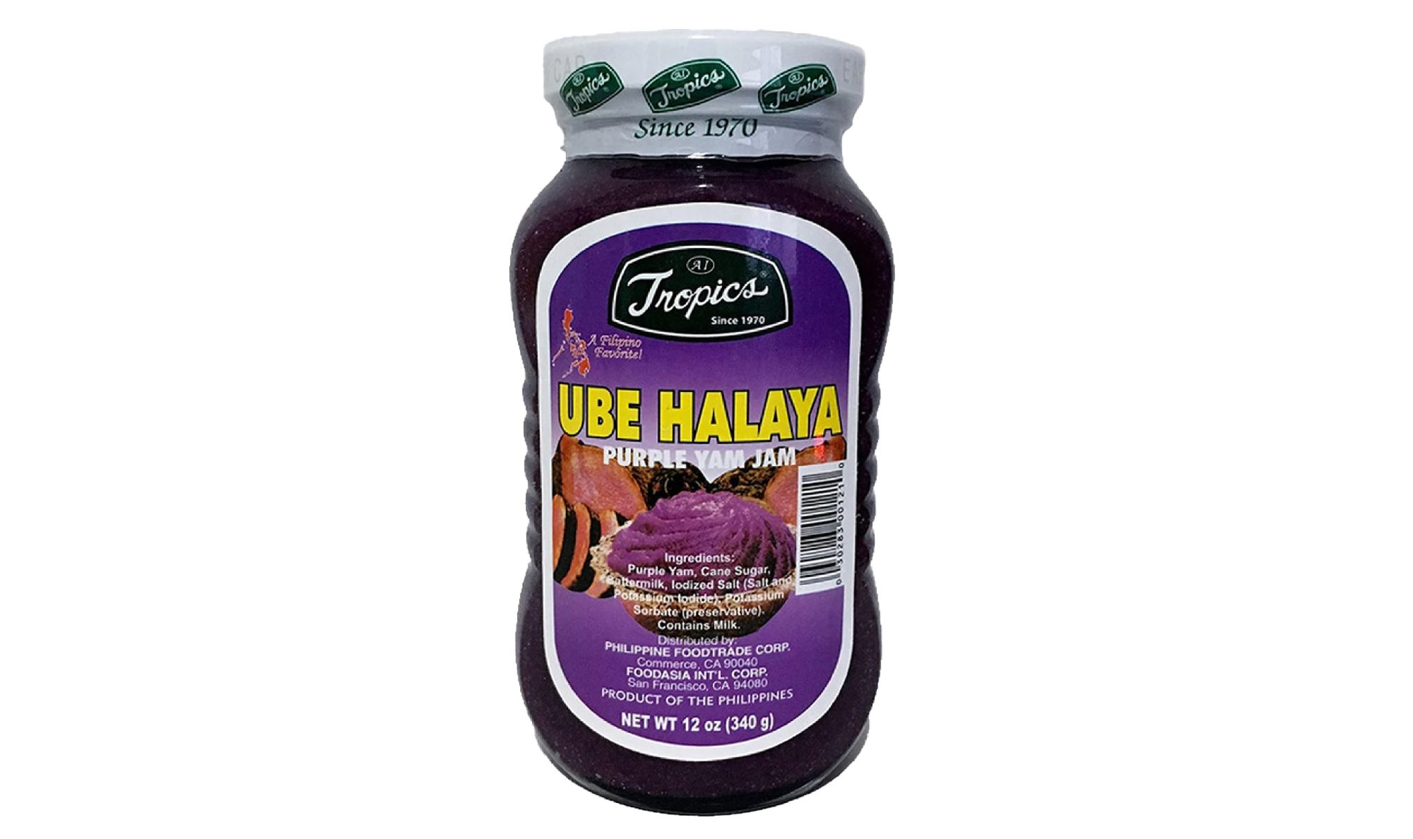
When evaluating Tropics' current packaging, we found its transparent packaging can be unflattering and the graphics are outdated and unappetizing. Moreover, it is lacks any educational information to invite new consumers who may be unfamiliar with what the product is.
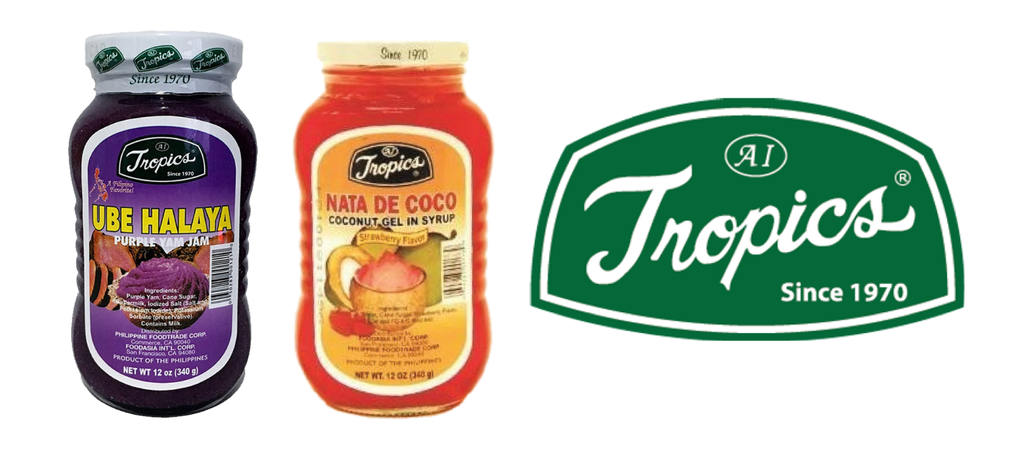
Tropics Sweet Preserves original designs
Our goals with this redesign were to (1) provide a better experience for current Tropics consumers and (2) attract a new audience of non-Filipinos.
In our consumer research, we built empathy for our Filipino and non-Filipino audiences. The greatest challenge with our Filipino audience is to convince them that these are authentic, fresh-tasting recipes. With our non-Filipino audience, educating them on how to serve these sweet preserves is the most important obstacle.
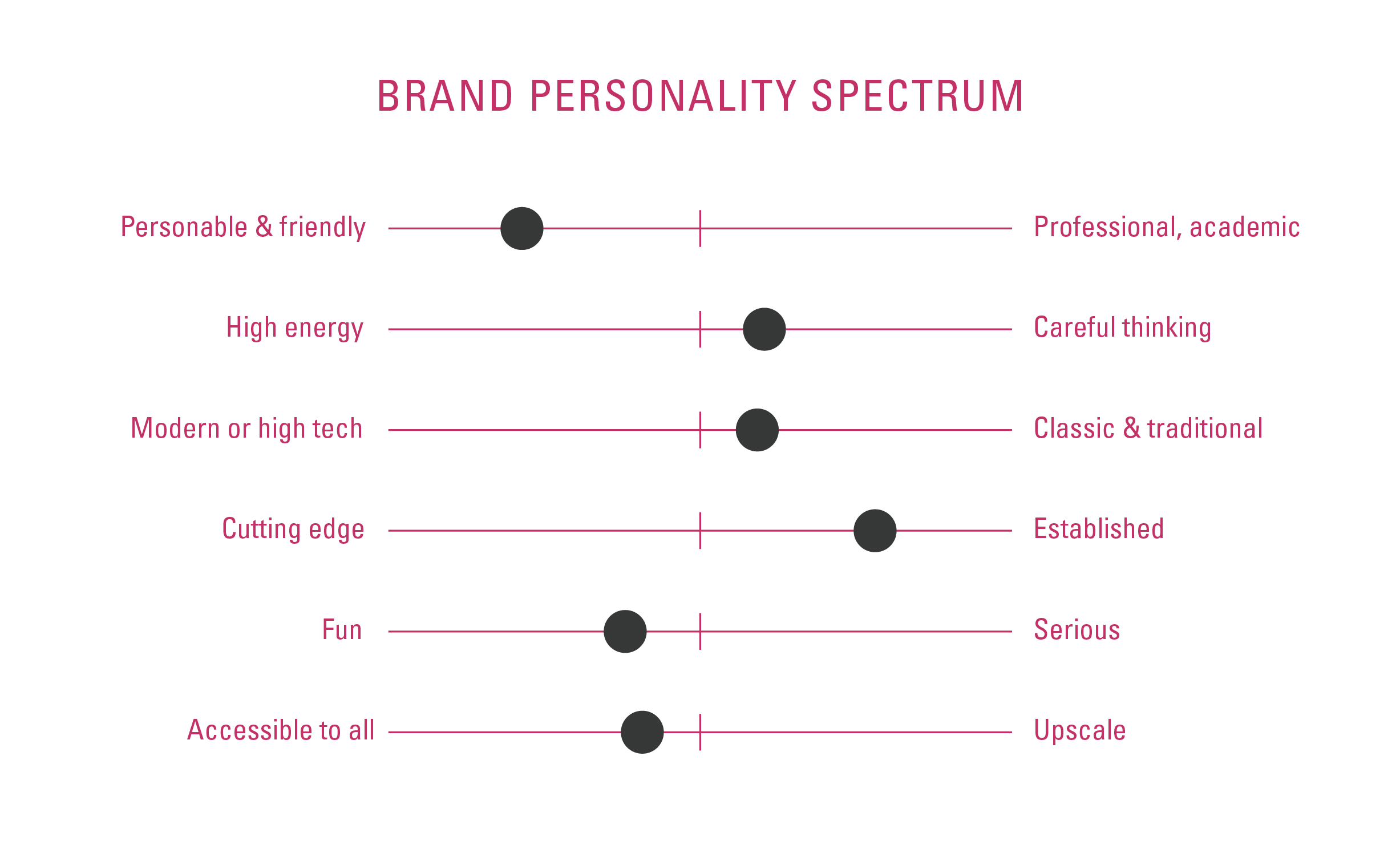
Brand personality spectrum & logo redesign
We decided to use a sampaguita as a mark which is the national flower of the Philippines. It added a fresh and healthy feel to the brand and made it distinctly Filipino. The logotype uses a more traditional typeface because of the brand's established history and traditional recipes.
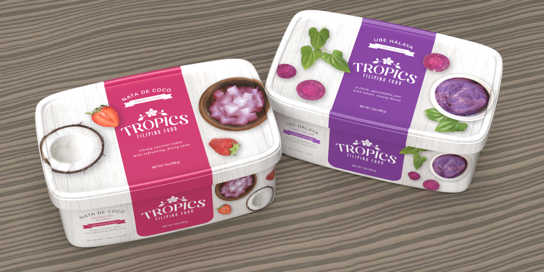
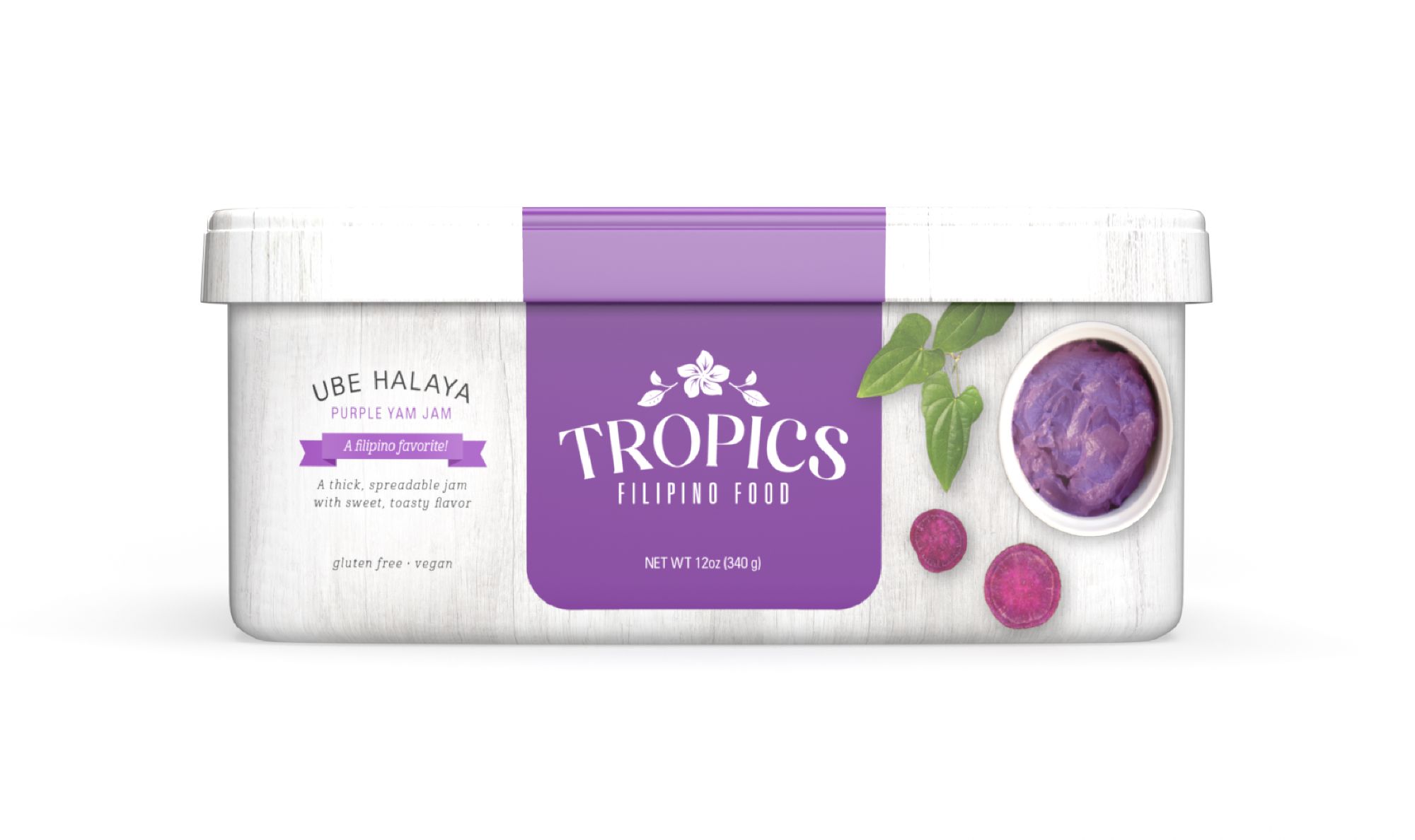
Coconut gel and ube jam packs
Our final graphics incorporate bright colors, which are characteristic of Filipino desserts. For educating consumers, there’s a taste description on the front of the pack and icons on the back describing how to enjoy it.
To communicate the brand’s values of tradition and family, we used photography that makes the package look like you’re looking down on a dinner table.
On-pack educational icons
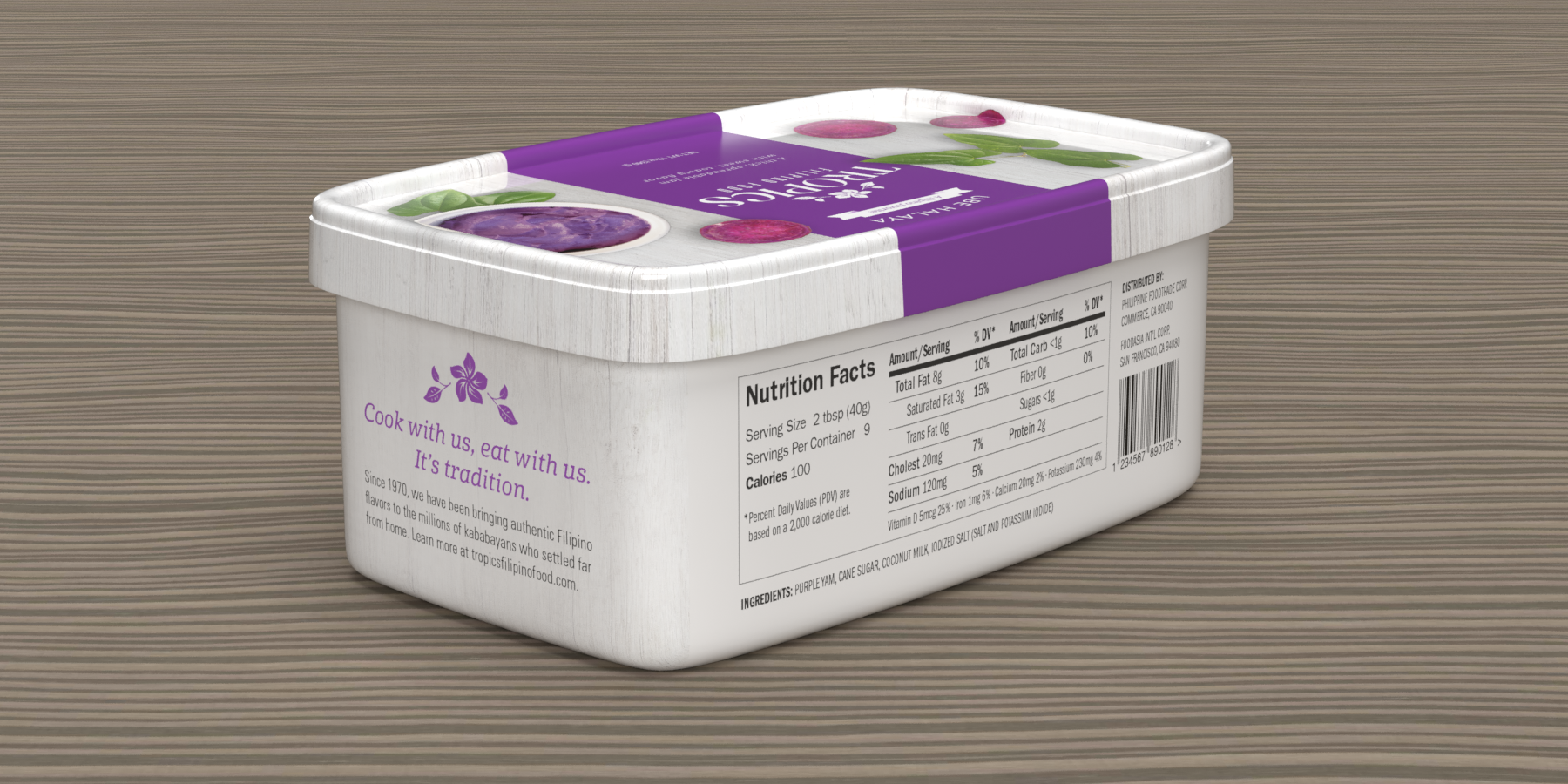
On-pack brand message and nutritional information