Compostable coffee tubes
Brand Identity / Packaging / Illustration
Coffee that's good for people and the planet; by Starbucks in partnership with the Rainforest Alliance.
Team members: Eleanor Green and Xiaodong Nie (Industrial Designers)
My role: consumer research, branding, iconography, illustration, graphic design, 3D rendering
Compostable coffee tubes
Coffee harvesting and production contributes to significant environmental issues that harm nearby wildlife, villages, and the world as a whole. Consumers today want coffee that’s ethically sourced and environmentally responsible.
My team discovered that there was an opportunity for to create an environmentally forward sub-brand of Starbucks that's Rainforest Alliance Certified with sustainable packaging. This would attract new consumers and get current Starbucks consumers to trade-up.
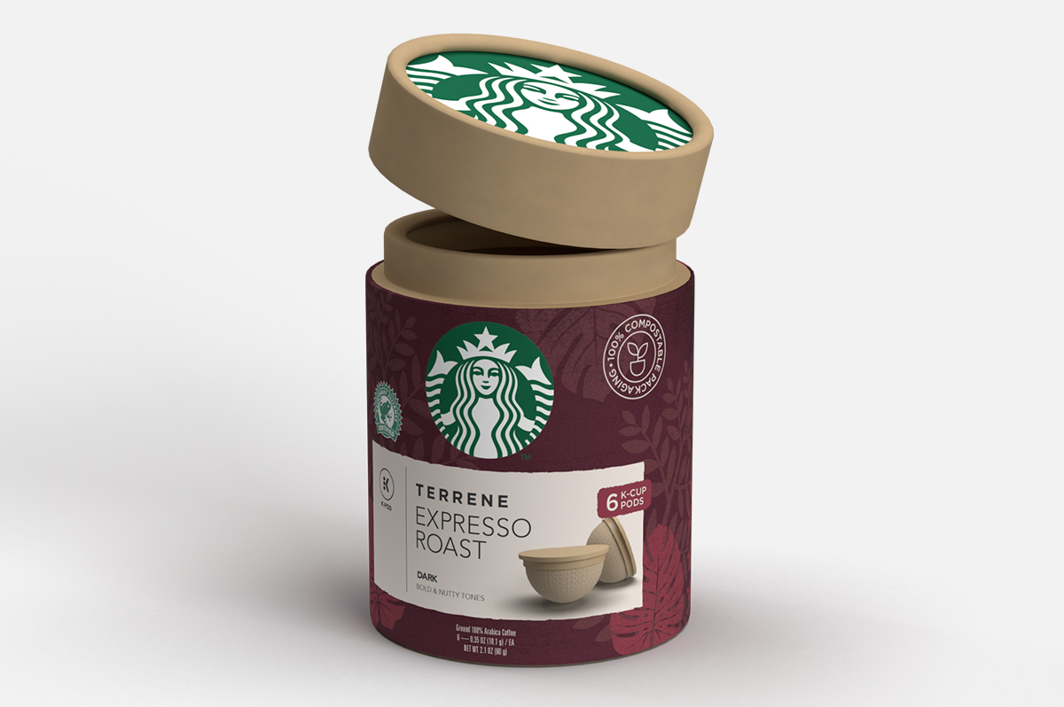
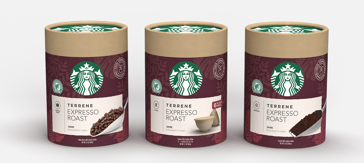
Compostable coffee tube
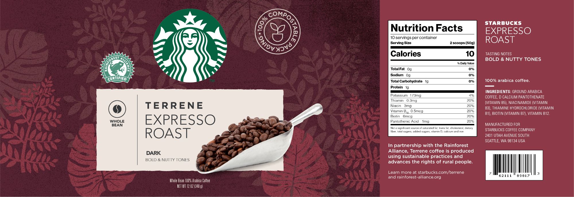
Whole bean coffee label
The packaging uses flat illustrations with organic shapes that are in-line with the Starbucks brand look and feel. The illustrations feature species native to Costa Rica—where the beans for this blend are sourced—to demonstrate what wildlife consumers are protecting with their purchase of this Rainforest Alliance Certified product.
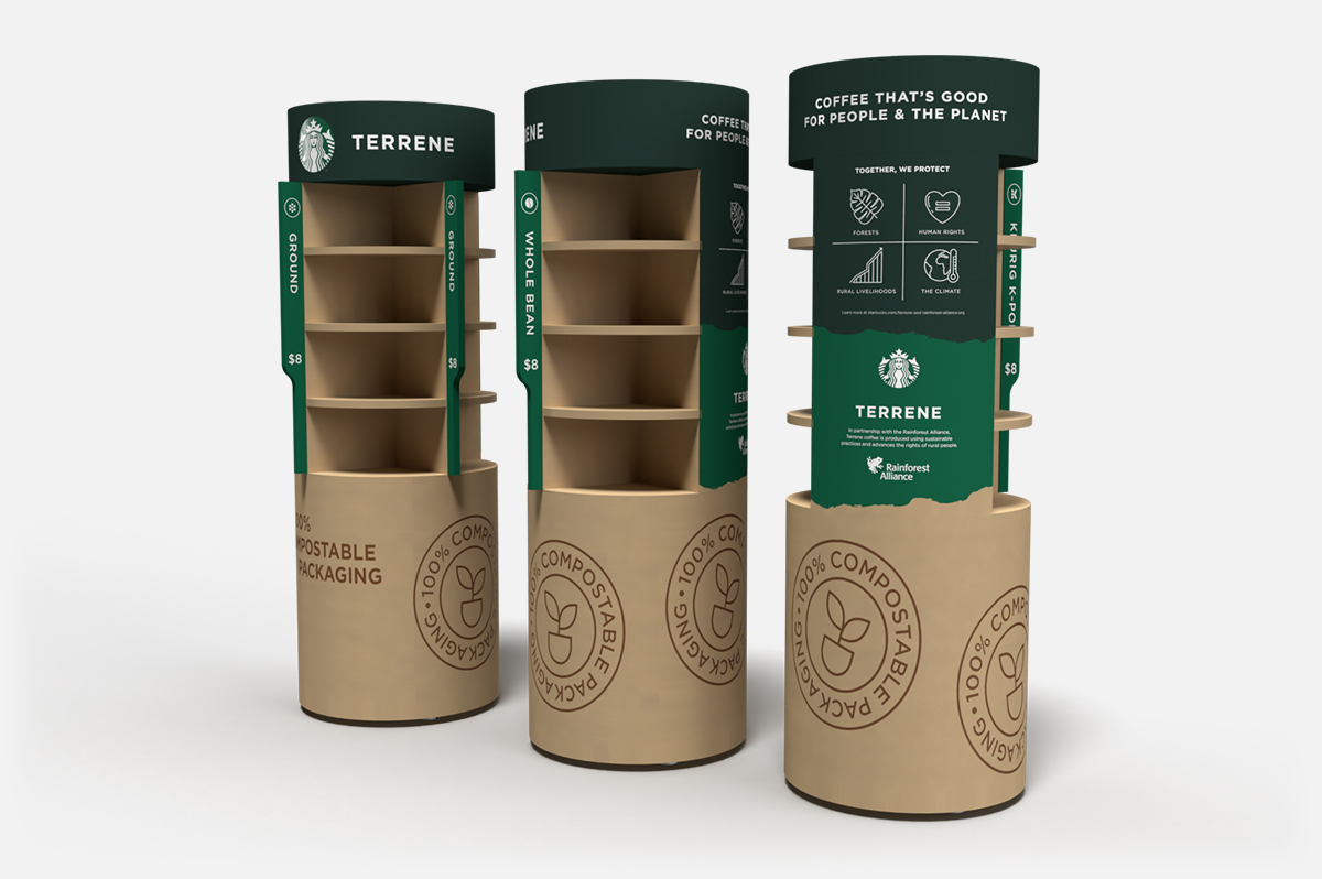
Point-of-purchase display
Texture is used throughout the brand identity to give this Starbucks sub-brand an earthy and authentic look.

Point-of-purchase display
The 4 pillars of the Rainforest Alliance are to protect (1) the forests, (2) human rights, (3) rural livelihoods, and (4) the climate. For this third-party certification, this sub-brand will cost a premium however our market research revealed that the majority of sustainably-minded consumers are willing to pay several dollars more for this certification.
Terrene logotype
Terrene is an Italian word meaning “of the earth.” We found this to be an especially appropriate name because of Starbucks’ Italian roots. In 1983, former CEO Howard Shultz visited Mulan and the romance of Italian espresso bars has been core to the brand ever since.
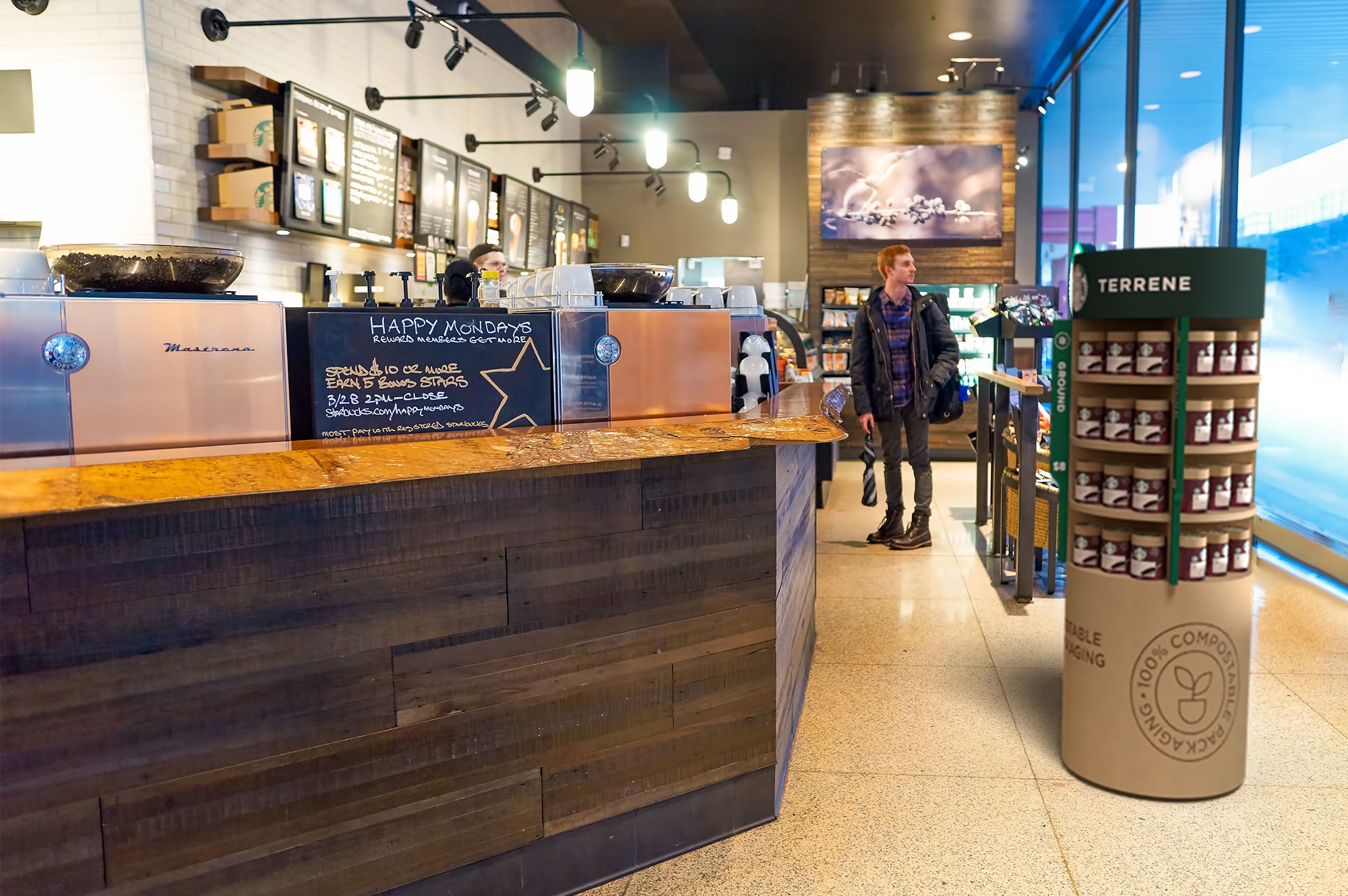
Point-of-purchase display in a Starbucks store
The Starbucks Terrene Expresso Roast comes in three different forms: ground, whole bean, and k-cup. The same packaging tubes are used for each forms to reduce the cost of producing the packaging. These tubes would be produced using a compostable paper board and Hubergroup compostable ink.
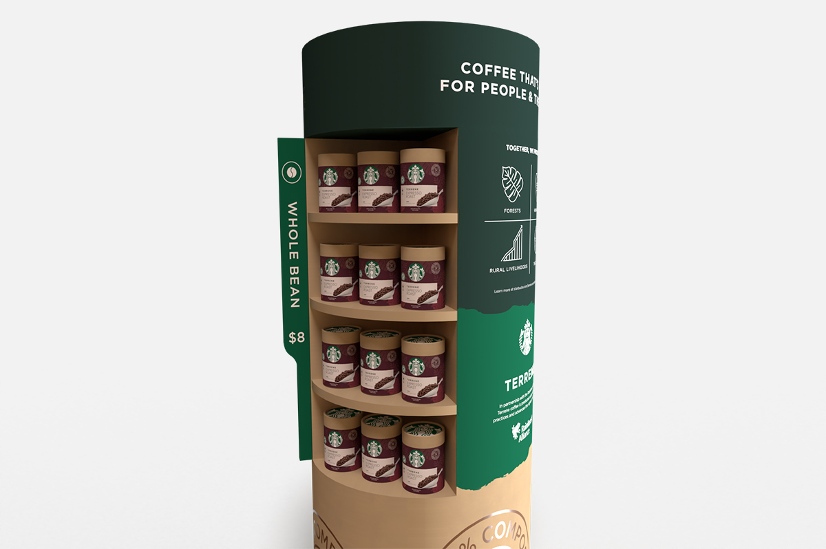
POP display and coffee tubes